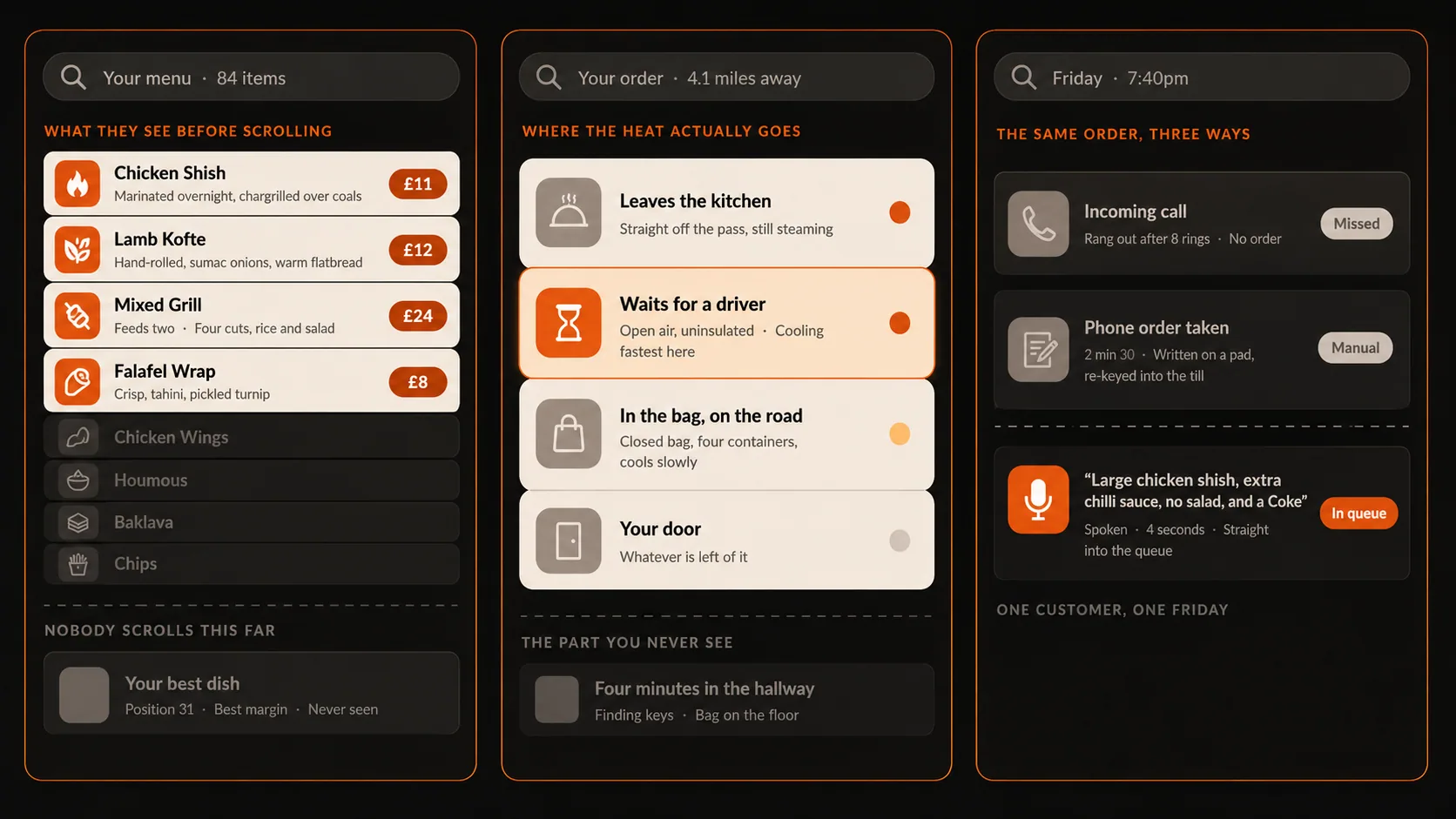
Open your own menu on your phone. Not on the office laptop — on the phone, the way a customer does it.
Count what fits on the screen before you scroll. It is usually four items. Maybe six.
That is your menu. Everything below it is a footnote that some people read and most do not, and if your best dish is at position 31 it may as well not be on there.
Below are six changes worth making, roughly in order of how much they return. They are all free. The first one you can do this afternoon with last month's sales report open in front of you.
1. Cut the list before you touch anything else
Eighty-four items is not choice. It is a decision the customer has to make on your behalf while standing at a bus stop.
Pull last month's item-level sales. Sort by units sold, ascending. Look at the bottom third.
You will find dishes that sold in single figures across a whole month, each of which still needs an ingredient in the fridge, a line on the prep list, a slot in someone's memory, and space on the screen where a better dish could be. The maths of a slow seller is not the margin on the ones you sold. It is the waste on the ones you did not, plus the six seconds every customer spent scrolling past it.
Cutting is the only change on this list that makes the kitchen faster and the menu better. Do it first.
2. Put the dish you want to sell where the thumb lands
Most menus are ordered by accident — the order things were added, or alphabetically, or by protein because that is how the printed one worked in 2019.
Positions one to three of your first category are the most valuable real estate you own. Whatever sits there gets seen by everyone, including the people who order in ninety seconds without scrolling.
So decide what should be there. Not the cheapest thing. Not the newest thing. The dish with a strong margin that you are confident the kitchen sends out perfectly at 8pm on a Friday, because that is the one that brings people back.
3. Describe the dish, not the ingredients
Compare these two lines for the same food:
Chicken shish — £11
Chicken shish — marinated overnight, chargrilled over coals, served with warm flatbread and sumac onions — £11
Same dish, same kitchen, same price. The second one tells the customer that somebody in the building cares, and it does the job your front-of-house staff would do if the customer were standing in front of them.
You do not need to do this for eighty items. Do it for the ten that matter and leave the rest as they are — a menu where every single item has a florid paragraph is just as hard to scan as one with none.
4. Fix the price formatting
Three small conventions, widely used in restaurant design and worth about five minutes of your time:
Drop the currency symbol where the layout allows. 12 reads as a number. £12.00 reads as a bill.
Drop the trailing zeros. £12, not £12.00.
Do not put the prices in a right-aligned column with dot leaders. That builds a tidy vertical list of prices, and a customer who reads the price column top to bottom is shopping, not choosing.
Set the price immediately after the description, in the same weight as the body text. The dish should be the loudest thing on the line.
5. Group by occasion, not by ingredient
This one is bigger than it looks.
Most menus are grouped the way a kitchen thinks: chicken, lamb, vegetarian, sides. Customers do not arrive thinking "I am in a lamb mood". They arrive thinking "there are four of us and nobody can agree" or "it is 10pm and I have not eaten".
Grouped like a kitchen | Grouped like a customer |
|---|---|
Chicken | Feeding four or more |
Lamb | Just me |
Vegetarian | Under 15 minutes |
Sides | Sharing platters |
Desserts | Something lighter |
The right-hand column answers the question the customer actually has. It also does something the left-hand column cannot: it makes a £42 mixed platter an obvious choice rather than an expensive one, because it is sitting under a heading that says feeding four instead of a heading that says lamb.
Keep the ingredient view as a filter if you like. Just do not make it the structure.
6. Make the add-on a question, not a category
Drinks and sides live at the bottom of most menus, which is to say they live somewhere nobody scrolls to.
A customer who has chosen their main is in a completely different frame of mind from one who is still browsing. They have committed. They are ready to be asked one easy question — anything to drink with that? — in exactly the way a good member of staff would ask it at the counter.
Asked at the right moment, that is the highest-converting thing on your menu. Left as a category at the bottom, it is decoration.
Start with your top ten
You do not have to rebuild the whole thing. Almost every takeaway makes most of its money from ten to fifteen dishes.
Print your top ten by units sold. For each one, ask three questions: Is it above the fold? Does it have a description worth reading? Is it grouped under a heading that matches why someone would order it?
Fix those ten. Leave the rest until you have seen what happens.
One menu, changed once
The reason most restaurants never do any of this is not that they disagree. It is that they have four menus.
There is the one on the website, the one on the till, the one on the tablet from the marketplace, and the laminated one on the counter. Changing a description in four places, correctly, on a Tuesday, is the kind of job that gets postponed forever — and it is why menus drift out of date until nobody trusts them.
FoodCiti runs everything off a single menu. Your website, your EPOS, your dine-in orders and your marketplace listing all read from the same place, so a description you rewrite once is a description that changed everywhere. Same for a price, and same for the thing you ran out of at seven o'clock.
That is not a menu feature. It is the reason the menu ever gets fixed at all.